 |
 |
You probably know Outlook 2007 introduced a new email rendering engine to Outlook, named Word. The big idea from Microsoft was to replace an html rendering engine with a wordprocessor rendering engine. This means most email out there now are full of coditional comments and the world is wasting petabytes and thousands email developers hours because of this brilliant choice. Microsoft already made a few major releases (Outlook 2010 and Outlook 2013) but still use the same rendering engine. Until Outlook 2016 the email rendering was really similar between the 3 versions, but now, with Outlook 2016 Microsoft brought this to an higher level: they keep using Word, but they introduced some more bugs to make us happy.
In the last few months I’ve started hearing people complaining because of weird 1px thick horizontal lines appearing in the middle of their email when opened in Outlook 2016.
A couple of months ago a Mosaico user reported an issue against Mosaico’s Master template, Versafix-1.
So, I decided to investigate the issue and find out the problem, but I failed…
First of all, in every screenshot I saw, the weird lines have the color of the background: so if your email body background and main content background have the same color you’ll probably won’t see the issue. Otherwise if you don’t see the issue you probably are simply lucky… try to make your email longer (more complex) and the issue will probably show up soon!
I spent at least a couple of days trying to simplify my email to isolate the issue, but I failed.
At first I thought I succeeded and found out the guilty code was the “cellspacing” attribute. I also created a minimal example showing the issue using simple tables with cellspacing. Here is the simplest HTML I’ve been able to write to reproduce the issue:

<html><body>
  <table bgcolor="green" cellpadding="0" border="0" cellspacing="9"><tbody>
    <tr><td>0</td></tr>
    <tr><td>1</td></tr>
    <tr><td>2</td></tr>
    ....
    <tr><td>79</td></tr>
  </tbody></table>
</body></html>
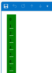
You can see the great Outlook 2016 rendering: note that the white line is not even in every <td>… one cell every ten or so is rendered fine:
Here is the Litmus Builder Project where you can also see that Outlook 2013 and older don’t show that weird lines. Litmus Builder project
So, once I found this I started rewriting my whole template to avoid using cellspacing, but I simply wasted more time because even without the cellspacing the issue was there!
Here is the simplest HTML not using cellspacing and showing that bad line of death.
<html>
<body bgcolor="green" text="#919191" alink="#cccccc" vlink="#cccccc" style="margin: 0;padding: 0;color: #919191;">
<table width="320" bgcolor="white"><tr><td>

  <table bgcolor="white" align="right"><tbody><tr><td style="font-size: 13px; font-family: Arial, Helvetica, sans-serif;">
    <h3 style="margin: 0; font-size: 18px;">Title</h3>

    <p style="margin: 10px 0px;">Far far away, behind the word mountains, far from the countries behind the word mountains, far from the countries behind the word mountains, far from the countries there live the blind texts countries there live the blind texts. </p>

  	<table bgcolor="white" align="left"><tbody><tr><td height="18" >A</td></tr></tbody></table>

  </td></tr></tbody></table>
<br><br>hello
</td></tr></table>

</body></html>
Unfortunately Litmus preview for Outlook 2016 Windows is down right now so I can’t give you the link. Update: Here is the Builder project
In this case even the smallest change to this html will produce good output:
So I started thinking something was wrong in my HT-email-ML as I didn’t find other people on the web talking about those f@@cking lines in outlook 2016 in their emails, so there must be something in the way I code email. I then opened a Mailchimp account and created a template using their drag and drop editor. I took one template, changed the body background color to a dark grey and added some block. I sent it to Outlook 2016 and whoops, I obtained 2 thin dark lines appeared in my Outlook 2016.
Now I cannot give you a solution. I can tell you that the issue is reproducible: the same code produces the same lines. But you change something at the bottom of your email and you see lines appearing or disappearing at the top of the email.
As emerged from Litmus discussion, Microsoft on a Technet discussion on the same strange behaviour, informally states that “this is actually a known issue, and still under investigation in production group”.