 |
 |
Have you ever created a responsive email using media queries to optimize it for smartphones, only to find that Samsung Email breaks the layout by using an excessively wide viewport? Even if your media queries are correctly interpreted and applied, texts become unreadable due to the wide rendering. We reported it as versafix template issue #37.
The bug was initially reported four years ago to the HTeuMeuLeu repository by Mark Robbins. Several workarounds were proposed, but none of them resolved the issue with our template.
In an attempt to address the problem, we reverse engineered made a lot of guessing about Samsung Email “Autofit” feature to understand why it was causing our autofitting email to display improperly.
Through testing, we discovered that the issue arose when the email’s HTML contained large elements with extensive “width” attributes or width properties in element styles. Notably, elements hidden with “display: none” did not trigger the issue.
It’s been a while since our previous release but it turned out Mosaico is pretty stable/solid and easy to extend via plugins!
On the other side it took 4 iterations to have our first 0.17.x stable release, namely the 0.17.3, because of unexpected issues with the newer version of our dependency TinyMCE and because of bugs in Safari rendering engine (WebKit).

Let’s see the changes…
We’ve had reports that our latest versafix-1 template (1.1.16) shows its mobile version on Yandex webmail even on desktop.
After some investigation we found that Yandex is stripping whole style attributes when the style contains something unexpected.
We did some search to find existing informations about Yandex issues, but found nothing relevant, so we decided to dig into it and document the behaviour.
Yandex.com webmail usually removes a properties if it doesn’t know it or doesn’t understand the property value, but it sometimes remove the whole style!
One of the strengths of Mosaico is its template-based approach. Most options Mosaico gives you when you edit a template are not hardcoded in the Mosaico Library. Instead, they are defined in the “master template”, by the template author.
A major design choice in the “template language” was that the template language is simply an extension to HTML, so that you can open a master template in your browser and see how it looks like, or you can edit it using your preferred html editor.
This is a major advantage when you have a master template with few options, but you’ll find repeating and copy and pasting a lot of html code if you want to create a full featured master template like our Versafix.
The repeating and copy and pasting tasks usually get you to more bugs, so while we updated our Versafix master template we decided to build a small generation tool to help with “deduplication” and maintenance.
Mosaico flagship master template is named Versafix-1 and the current version (1.0.6) is used by thousands of users around the world, every day, to create effective and responsive emails.
In the past 2 years we analized how people used Versafix, what were the most commonly altered styles and collected a lot of feedback and feature requests!
We followed the suggestions, but before we detail the improvements, we want to let you know the basics:
GoodEnough, a small web agency from Paris, just published a full web application built around Mosaico to let companies easily install a complete environment where multiple users can work on email templates using Mosaico.
The project repository started as a Mosaico fork, but in fact we now see it as an application that depends on Mosaico. We are working with GoodEnough so to let their customization being developed as plugins instead of altering the main code, so it will be easier to keep up with new Mosaico releases.
The App has a very good looking material design and is very easy to use and you can easily appreciate their UX skills!
When Outlook.com/Office365 find an A tag without the HREF or with an empty HREF or an HREF with the value “#” then it will get very upset and will remove the link tag.
This is a known bug documented by the great “email hacker” Rémi Parmentier*
<!DOCTYPE html>
<html xmlns="http://www.w3.org/1999/xhtml"><head>
<meta http-equiv="Content-Type" content="text/html; charset=UTF-8">
</head>
<body style="font-size: 30px;">

<a style="color: red; background-color: yellow;"></a>
<p>A paragraph</p>
<p>Second paragraph with no style</p>
<p style="">Third paragraph with style</p>
<p style="">Fourth paragraph with style</p>

</body></html>
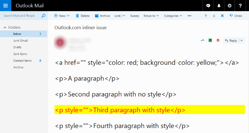
So we are not surprised our link is not red on yellow, but look at how Outlook.com renders the “Third paragraph” for the previous code:

It sounds like an almost “random” element in the page will get the styles once belonging to your “unlinked” link.
Our tests proved that the element is not “random” (of course) but it is the first following (in the DOM traversing) element with a “STYLE” attribute.
So, this is just another reason to stay away from empty links.
(*) We suggest you Rémi’s latest post about Outlook.com weird bugs
If you want high compatibility you probably inline your main styles, otherwise Libero.it, Mail.ru, Naver, Telstra, T-Online, Terra, Yandex and many other won’t style anything.
But, you may also have other styles that are not inlined and you want them to be displayed by smart email clients.
In past the best solution was to put the style declaration inside the body, but you know that since Oct 2016 Gmail introduced partial styles support and they only use them if they are declared in the HEAD.
Then you find out that Yahoo App for Android doesn’t show your styles anymore because it will simply strip any style from the HEAD (why? who knows.) You won’t find many informations about Yahoo App rendering, the only reference I found is here:
FreshInbox(*) in that article documented that Yahoo Mail App for Android supports only styles declared in the BODY.
So, what to do? Insert the whole style declaration twice? Drop support for Yahoo Mail App for Android?
…enabling styles for Yahoo Mail App for Android and Gmail without the need to duplicate them (and doesn’t break other clients, AFAIK).
Simply use a “double head”, by addin an empty <head></head> before your real <head>. Yahoo App for Android will strip that first head and leave your second head in place.
From our tests, both manual and via Email On Acid, this works everywhere.
I tried adding styles to both “heads” and clients supporting non-inline styles will see both of them, but GMX.de and Web.de (and of course Yahoo App for Android) that will only see the second HEAD styles (the ones we care).
<html>
  <head><!-- Yahoo App Android will strip this --></head>
  <head>
    <meta ... >
    <style>
      your styles
    </style>
  </head>
  <body>
    your content
  </body>
</html>
Disclaimer: using 2 head tags makes your HTML “malformed”. Do you care? Also using the style tag in the body was invalid.
(*) Remember: the best single page resource for updated email rendering issues in 2017 is FreshInbox. Most of other pages around are simply outdated and keeps telling you to use uppercase Margin or [class] selectors. Don’t be confused by the “kinetic” titles, it is a great resource even if you don’t care about kinetic emails.
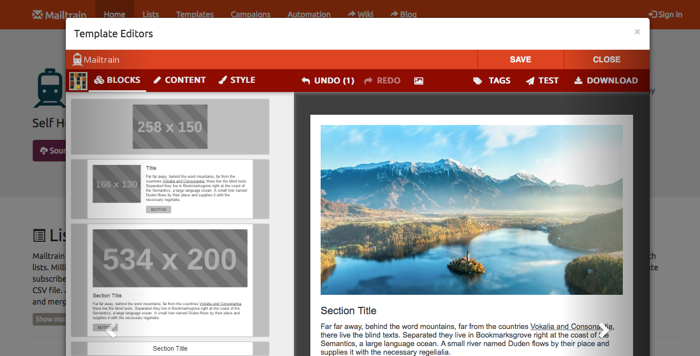
Mailtrain defines itself as “Self Hosted Newsletter App Built on Top of Nodemailer”: it’s an open source project, born in 2016, meant to be an alternative to commercial ESP to who prefer a self hosted service, with complete control on the software beneath.

Mailtrain has grown a lot in the past year, and has a fairly huge fanbase (over 1.300 stars on GitHub): its ambitious roadmap includes not only the basic newsletter send features (list management, custom fields, list segmentation, bounce analysis…) but also a number of advanced tools, like RSS campaigns, GPG Encryption, Automation.
Responsive Emails has been a trending topic in Email Marketing since last five years. Today most emails are read on mobile devices, so responsiveness is a must, but many email clients and webmails have a really limited support of media query, the main css way to make responsive html layout.
Until Sept 2016 (when Gmail started supporting non-inline styles and media queries), the most problematic clients were Outlook and Gmail (both web and app); to overcome these problems many techniques have been developed - mainly table based layouts with conditional comments to satisfy Outlook a lot of inlined CSS to make Gmail happy.
Someone started to use mobile-first templates, letting media queries manage the desktop version - where it was possible.
Then Hybrid Coding / Spongy technique emerged: a mix of well balanced inline styles, with min-width/max-with and width tricks, letting also Gmail have its proper adaptive version even if not fully responsive.
Hybrid coding has been adopted by many email templates (also Versafix-1 Mosaico Template use it) even if the rendering of responsive version in Gmail was not perfect.
A new technique emerged early in 2016, called the Fab4, mixing the width, min-width, max-width (all already used in hybrid coding) with a CSS calc() trick.
Fab4 has a completely different approach: no table based layout - all inline-block divs - and a calc() based breakpoint, based on the parent width instead of media queries.
The basic is (to be inlined):
.block {
    display:inline-block;
    min-width:50%;
    max-width:100%;
    width:calc((480px — 100%) * 480);
}
In this brief example 480px is the brackpoint: if parent width is under 480px the calc-computed .block width will be over the max-with of 100%, so the div will limit its width to the max-width value, occupying the whole space, making multiple .block stack in a single column.
If the parent width is over 480px, then the calculated width will be a negative number, so the box will shrink to the min-width of 50%, and the .block will be arranged into a two columns layout.
The method is really smart but has 2 big limits:
For the record the final version proposed in the original article is:
.block {
    display:inline-block;
    min-width:240px;
    width:50%;
    max-width:100%;
    min-width:-webkit-calc(50%);
    min-width:calc(50%);
    width:-webkit-calc(230400px — 48000%);
    width:calc(230400px — 48000%);
}
This simply introduces “-webkit-“ prefixed calc so to support older WebKits and does the math in the calc expression because some webmail removes styles with an asterisk or double brakets.
So, the method proved to be solid and Campaign Monitor has rewritten its responsive templates to use this technique - alongside a series of conditional comments table layout bit and other minor tricks to achieve complete Outlook compatibility.
So, is the Fab4 method still useful? Maybe.
If you look at global shares Gmail was the only email client having a need for the Fab4 method, but if you send to specific non-US markets or you also care for less used email clients then you may still need it.
Here is a list of local/regional providers that you don’t find in “global stats” but are big in specific countries:
For example in Italy (we are italian so we prefer to talk about what we know well) the 4 “local” providers above generate more than 30% of total email opens and Libero.it alone is the first provider with more users than Gmail.
So, it worth testing each “method” also against webmails or mobile apps being relevants for your target and not only against the major global providers.
In our tests we found that QQ.com, Terra, GMX, Web.de and Yandex will show Fab4 mobile version, failing to use whole desktop space, when available. On the same webmail systems, spongy technique (tested with our Versafix-1 template) works well, showing full desktop version. Orange.fr has problem with both tecnique, but slightly minor with Versafix-1/hybrid/spongy; on Lotus Notes 8.5 Fab4 fails in bad ways, while Versafix-1 looks good.
By now we know that Gmail transition towards full media query support is not yet completed: IOS client seems to be stuck on “old” Gmail rendering system and also Gmail webmail mobile version is not accepting media query so far. On both Gmail version (IOS and Webmail mobile) Fab4 technique works well.
As said before, Fab 4 technique is born mainly to go beyond “old” Gmail limits, and give a proper responsive email version also on non media query compatible webmail and clients.
With brand new Gmail media query support this need seems to be outdated, but so far transition is still uncomplete and there are also many local webmail that are incompatible with media query.
To sum up Fab4 could be a nice option if you are mostly mobile-oriented: this method renders slightly better in mobile versions than Spongy/Hybrid technique (not so much, by the way), anyways you have also to consider that Spongy/Hybrid technique seems to react in a more solid way with “problematic” clients and webmails.
Yes, today MOSAICO grows up: exactly one year ago, we released the first version of MOSAICO code on GitHub.
We’ve always thought that MOSAICO would have been a “game changer” in email template design: for the first time a complete and functional responsive email editor was released as an open source project.

Since that day MOSAICO project raised over 400 stars and 140 forks on GitHub, growing day by day.
In order to make emails and email templates compatible with most of the clients and webmails out there, we know that we have to avoid at most everything that is not pure inline css1 style.
To be honest this is true mainly for the two bad guys of email rendering - Outlook and Gmail - but a lot of other webmails and clients have some glitches and behaviour that makes inline style the good choice.
Coding direct inline styles is really an hell of work, and every little adjustment means tons of code, with lot of errors and mistyping.
So here come Email CSS inliners: these lovely pieces of code take your css and html and give you back your “css inlined” email template, ready to be sent.
Simple (ahem…) and effective (ahem…), but how inliners do work and how much are they reliable?
How do I choose my inliner? Many ESP have their native inliners, and some other are available on web or as library.
We tried to analize the most used of them, in order to understand the strategy behind, the weakness and the strenghts.
Every single webmail system has its way to handle email rendering: to avoid security issues and to prevent css inconsistent transformation of the whole interface, webmail systems cut and transform many css instructions. One of the most strict is Gmail: no style, no mediaquery, and many css properties being deleted.
Yahoo works in a similar way, too, but recently they changed something and @nicolemerlin tweeted:
Yahoo! Mail seems to be adding overflow-x:auto to long divs, resulting in scrollbars + content squishing/stacking
It turned out that if you use max-width and max-height inline properties, then Yahoo will add an odd “overflow-x: auto” and/or “overflow-y:auto”. The use of max-width and max-height properties, otherways, is common, if you consider that Yahoo will transform any “width” and “height” properties in “min-width” and “min-height”.
The reason the overflow properties is added is not clear, yet: maybe it could be to prevent hiding some content from the message.
Email clients world is wide and complex: not considering the most used ones, there’s a whole bunch of “minor” clients for every device and operative system.
Every client has his bugs and glitches (and template editors like Mosaico exist to simplify all this mess), and there’s no day without a new surprise. This time we talk about Postbox for Mac, a powerful, yet not so used, client; his rendering engine is based on Gecko, like Thunderbird.
So we do not expect much suprises from this wonderful client. Mhh, not so much, but we’ve found one behavior that’s not “standard” and that potentially breaks one of the classical trick used to keep a table cell narrow as we want - with a background color.
You probably know Outlook 2007 introduced a new email rendering engine to Outlook, named Word. The big idea from Microsoft was to replace an html rendering engine with a wordprocessor rendering engine. This means most email out there now are full of coditional comments and the world is wasting petabytes and thousands email developers hours because of this brilliant choice. Microsoft already made a few major releases (Outlook 2010 and Outlook 2013) but still use the same rendering engine. Until Outlook 2016 the email rendering was really similar between the 3 versions, but now, with Outlook 2016 Microsoft brought this to an higher level: they keep using Word, but they introduced some more bugs to make us happy.
In the last few months I’ve started hearing people complaining because of weird 1px thick horizontal lines appearing in the middle of their email when opened in Outlook 2016.
A couple of months ago a Mosaico user reported an issue against Mosaico’s Master template, Versafix-1.
So, I decided to investigate the issue and find out the problem, but I failed…
Most email marketers use “hidden” images in order to track opens, along with openers IP and user agent, they are often called “tracking pixel” or “webbug”.
These informations are vital to email senders and can be used to geo-localize users or detect the device/client they use to read email.
Like “cookies”, email tracking has been criticized for years, and most email clients implemented solutions to block remote contents until the user willingly unblock them. Nowadays most clients, and also webmail, don’t “bore” their users with broken images and tedious unblock systems.
IOS mail app and Mac Os X “Apple Mail” have been the first to launch this “new wave”, and they also provide the best experience with regard to support for “web-level” HTML support. “Modern” HTML provides many ways to include remote content within the html body: audio, css, video and also scripts.
Some of these “features” bring not only privacy issues, but also security issues.
Most email clients have methods to get rid of most of them, but sometimes you wouldn’t expect how many privacy holes can be hidden in a simple email being viewed. Mike Cardwell developed Email Privacy Tester in order to test the behaviour of various email clients and webmail BEFORE and AFTER the image unblock, so that anyone can privacy-proof his email client.
Once again Outlook seems to be a nightmare for all email coders. In the process of design and coding the Versafix template used in Mosaico, we faced many strange and subtle issues in the way browsers and clients render the final results. One of the worst issues at first seemed just a little glimpse in the way Outlook manage the Social Icons block. In order to let the user specify the number and the type of icons, we just manage them as simple inline IMGs, specifing an hspace properties (since we know that Outlook does not render css margin)
<img hspace="10" src="facebook.png">
<img hspace="10" src="linkedin.png">
It turned out that this solution mostly works, but Outlook 2007/10/13 do not show the “hspace”. Obviously trying to add padding/margin via CSS has no results, since Outlook merely ignore them.
Everybody knows that Gmail -web or app- does not support media query at all, stripping the whole section from emails. This for, after much try and test, retry and retest, someone figured out how to get a “simil-responsive” behaviour without css at all. This approach is called “hybrid coding” and by now is used by many template designers and also by email template builder like Mosaico. Hybrid Coding works making use of width/max-width or width/min-width couples, adding some conditional comments table structures for Outlook compatibility.
<!--[if (gte mso 9)|(lte ie 8)]>
    <table align="center" border="0" cellspacing="0" cellpadding="0" width="570">
        <tr>
            <td align="center" valign="top">
<![endif]-->
<div class="oldwebkit" style="max-width: 570px;">
    <table style="border-collapse: separate;border-spacing: 9px;width: 100%;max-width: 570px;background-color: #fff;" class="vb-row fullpad" bgcolor="#ffffff" border="0" cellpadding="0" cellspacing="9" width="570">
        <tbody>
            <tr>
                <td class="mobile-row" style="font-size: 0;" align="center" valign="top">[...]
However this approach is not perfect: if you have three column layout, the stacked blocks on mobile version will not cover the whole screen, due to the max-width value being lower than the viewport width.
In the last few years a lot of free to use email builders have been published on the web! This is a great news because creating a responsive email that works fine on most email clients is a real PITA.
Here we try to define a basic classification for email template builders, for their Business model and for their Architectural choices.
When you use a free tool it may help to understand what’s the plan to monetize it:
some tools are offered for free as a channel to promote other services, usually an ESP service: FreeEmailEditor and BeeFree belongs to this category
some other tools are provided for free with the hope you will buy commercial templates: Stamplia and MailSalad do this
some other tools are free as in freemium, so a free version exists to let people know the commercial version: Responsizer, BeeFree, EdmDesigner and partly Mosaico belongs to this group
Being the only opensource product, Mosaico has a special position in this categorization: of course we hope to make some money by providing Commercial Support for Mosaico but we mainly opensourced it with the hope to create a community around it.
You will also find plenty of proprietary Email Editors built-in in the platform of most email marketing firms like Mailchimp, CampaignMonitor, BenchmarkEmail and many more.
After more than an year of research and development of Mosaico our Email Editor, we decided, this september, to let it out as Open Source project on gitHub.
 This decision was made after thinking a while, some dozen hours of meeting and an undeterminated number of coffee cups (espresso, please).
Mosaico is born to be the standard responsive editor of the italian indipendent ESP VOXmail. Developing it was an hard work, trying to keep the UX as smooth as possible and maintain a certain level of flexibility.
The features and the complexity of the editor (and the flexibility given to the user) are based on the template itself and not hardcoded in the editor interface. This means that potentially anyone could convert his template in order to work with Mosaico.